
Guide App Design for Hubei Provincial Museum
Guide App Design for Hubei Provincial Museum
Guide App Design for Hubei Provincial Museum
01 · Overview
01 · Overview
Project Type
Solo Project / App Design
Project Type
Solo Project / App Design
Timeline
4 months (Mar-Jun, 2026)
Timeline
4 months (Mar-Jun, 2026)
My Role
Solo Product Designer
My Role
Solo Product Designer
Overview — The Hubei Provincial Museum's massive layout and dense exhibits easily cause visitor fatigue, compounded by pain points like repetitive, tedious browsing and inconvenient access to exhibit information.
Overview — The Hubei Provincial Museum's massive layout and dense exhibits easily cause visitor fatigue, compounded by pain points like repetitive, tedious browsing and inconvenient access to exhibit information.
What I did — Based on user research and an ecosystem audit, I completed the product design and iterations, creating a high-fidelity app prototype that offers recommended routes, integrates exhibits positioning, and provides convenient access to exhibit information. Ultimately, the prototype achieved a 4.4/5 user willingness rating in usability testing.
What I did — Based on user research and an ecosystem audit, I completed the product design and iterations, creating a high-fidelity app prototype that offers recommended routes, integrates exhibits positioning, and provides convenient access to exhibit information. Ultimately, the prototype achieved a 4.4/5 user willingness rating in usability testing.
02 · Background — Why the Hubei Provincial Museum?
02 · Background — Why the Hubei Provincial Museum?
Visiting major museums has become a mainstream travel habit in China. Yet browsing large museums today commonly leads to fatigue, and it’s difficult for visitors to access information about the exhibits in front of them.
Visiting major museums has become a mainstream travel habit in China. Yet browsing large museums today commonly leads to fatigue, and it’s difficult for visitors to access information about the exhibits in front of them.
Even though it’s indoors, walking around the museum ended up being more exhausting than spending a whole day at the amusement park.
Guangdong Science Popularization
Even though it’s indoors, walking around the museum ended up being more exhausting than spending a whole day at the amusement park.
Guangdong Science Popularization
Placing an object in a glass display case with just a label showing its name and era, you can imagine how confused the audience would be.
China Cultural Relics News
Placing an object in a glass display case with just a label showing its name and era, you can imagine how confused the audience would be.
China Cultural Relics News
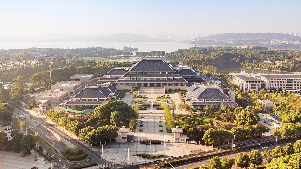
The Hubei Provincial Museum receives over 5 million visitors a year, with a large multi-hall layout and high-density exhibit distribution. To understand the resulting visitor friction, I studied the current browsing experience."
The Hubei Provincial Museum receives over 5 million visitors a year, with a large multi-hall layout and high-density exhibit distribution. To understand the resulting visitor friction, I studied the current browsing experience."
03 · User Research — What visitors said
03 · User Research — What visitors said
Through 1-on-1 interviews with 8 visitors, I identified three core behavioral patterns and synthesized them into a persona:
Through 1-on-1 interviews with 8 visitors, I identified three core behavioral patterns and synthesized them into a persona:
01
Visitors find browsing large museums exhausting, but push through anyway — they don’t want to miss anything good.
“Most people can't even make it through the whole museum. You constantly see visitors sitting on the floor just to rest.”
01
Visitors find browsing large museums exhausting, but push through anyway — they don’t want to miss anything good.
“Most people can't even make it through the whole museum. You constantly see visitors sitting on the floor just to rest.”
02
Repetitive-feeling exhibits are boring; visitors want to know what matters and where it is, not just what’s on display.
“The exhibits feel so repetitive. The longer you browse, the more boring it gets.”
02
Repetitive-feeling exhibits are boring; visitors want to know what matters and where it is, not just what’s on display.
“The exhibits feel so repetitive. The longer you browse, the more boring it gets.”
03
Visitors want autonomy over how they get exhibit information and control over their own pace.
“I didn't even get a chance to read the plaque for the Sword of Goujian before getting pushed along by the crowd.”
03
Visitors want autonomy over how they get exhibit information and control over their own pace.
“I didn't even get a chance to read the plaque for the Sword of Goujian before getting pushed along by the crowd.”
Persona
Persona

04 · Audit — How the Hubei Provincial Museum did
04 · Audit — How the Hubei Provincial Museum did
I audited three digital tools visitors currently rely on when exploring the Hubei Provincial Museum:
I audited three digital tools visitors currently rely on when exploring the Hubei Provincial Museum:
Hubei Provincial Museum Official Website
Lists every hall and lets visitors filter the collection by exhibit type.
Text-only presentation, the exhibit search function is messy and has a lot of irrelevant information.
Hubei Provincial Museum AI Guide
Provides a 3D map of the museum, with some exhibition halls marked with the locations of key exhibits.
Fails to provide contextual exhibit details for visitors.
Huizhi Guide (Exhibit Audio Guide)
Offers spoken narration for a portion of the museum’s exhibits.
Audio-only presentation, and unable to provide exhibit locations.
Hubei Provincial Museum Official Website
Lists every hall and lets visitors filter the collection by exhibit type.
Text-only presentation, the exhibit search function is messy and has a lot of irrelevant information.
Hubei Provincial Museum AI Guide
Provides a 3D map of the museum, with some exhibition halls marked with the locations of key exhibits.
Fails to provide contextual exhibit details for visitors.
Huizhi Guide (Exhibit Audio Guide)
Offers spoken narration for a portion of the museum’s exhibits.
Audio-only presentation, and unable to provide exhibit locations.
05 · Problem
05 · Problem
So, where's the problem?
So, where's the problem?
01
Lack of clear guidance and recommendations
Visitors are forced to browse hall by hall sequentially. This inefficient exploration rapidly drains their physical energy.
01
Lack of clear guidance and recommendations
Visitors are forced to browse hall by hall sequentially. This inefficient exploration rapidly drains their physical energy.
02
Unable to quickly locate specific exhibits
Beyond the few highlighted treasures, visitors still have to blindly search through the rest of the massive and homogeneous exhibits, wasting time and energy.
02
Unable to quickly locate specific exhibits
Beyond the few highlighted treasures, visitors still have to blindly search through the rest of the massive and homogeneous exhibits, wasting time and energy.
03
Friction in accessing exhibit information
Limitations across both online and offline channels create barriers to exhibit details, stripping visitors of the autonomy to explore at their own pace.
03
Friction in accessing exhibit information
Limitations across both online and offline channels create barriers to exhibit details, stripping visitors of the autonomy to explore at their own pace.
06 · Design Goal & Solution
06 · Design Goal & Solution
Design goal
Provide visitors with seamless, coherent exploration support that eases physical fatigue while enhancing the quality of their visit—without compromising their autonomy.
Provide visitors with seamless, coherent exploration support that eases physical fatigue while enhancing the quality of their visit—without compromising their autonomy.
Solution
Solution
01
Respect visitors’ time and energy without compromising the quality of their visit.
Respect visitors’ time and energy without compromising the quality of their visit.
Recommended routes sized to how long visitors plan to stay.
02
Surface a high-level view of exhibit distribution so visitors can quickly skip what won’t interest them.
Surface a high-level view of exhibit distribution so visitors can quickly skip what won’t interest them.
Map thumbnails mark ordinary vs. must-see exhibits and exactly where they are.
03
Put exhibit information — and how to access it — in visitors’ own hands.
Put exhibit information — and how to access it — in visitors’ own hands.
In-map info cards offer further detail as text or audio, on demand.
A collection index, cross-filterable by hall and exhibit type.
07 · Design & Iterate
Information Architecture
Information Architecture

Wireframes
Wireframes
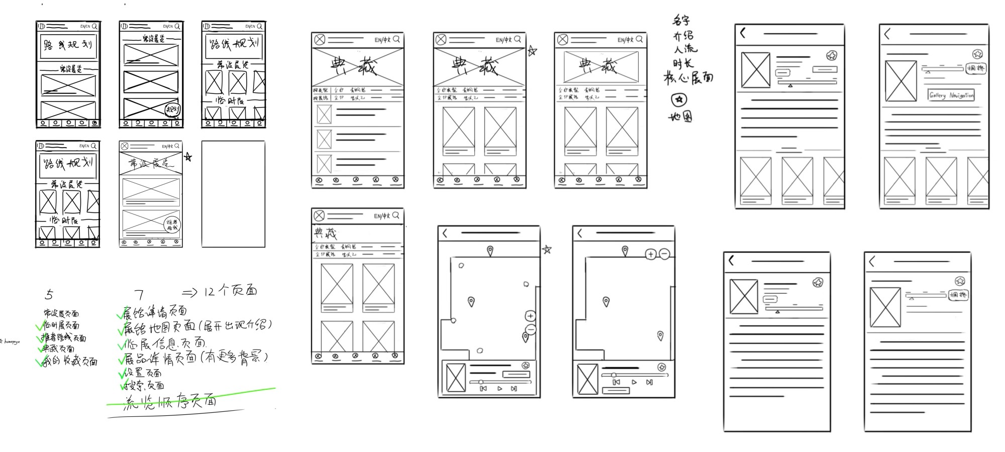

Digital Wireframes & Core Flow
Digital Wireframes & Core Flow

Iterations
Iterations
I conducted the first round of usability testing on the low-fidelity prototype. Below are the key findings and the corresponding design iterations:
I conducted the first round of usability testing on the low-fidelity prototype. Below are the key findings and the corresponding design iterations:

Before

After
Before
The settings button’s placement gave no hint it was there — every participant struggled to find it.
After
I renamed 'My Favorites' to 'My Favorites / Settings' to clearly indicate that settings are located on this page.
Before

After
Before
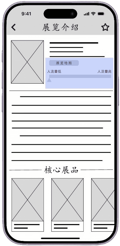
The “Hall Map” button wasn’t prominent enough.
After
I reworked the hall details layout and enlarged the map entry point.

Before

After
Before
The filter order (exhibit type, then hall) didn’t match participants’ expectations, and there were too many filter categories to page through by swiping alone.
After
I prioritized the hall filter above the exhibit-type filter to match visitors' mental models, and added a small menu next to each row so they can easily expand and browse all categories at once.
Sticker Sheet
Sticker Sheet
To maintain visual consistency with the Hubei Provincial Museum's digital identity, my high-fidelity prototype adopted the official website's color palette and similarly styled elements. During this stage, I refined the card components to create clear visual distinction—using standardized horizontal cards for exhibition halls and vertical or square cards for exhibits—and created a sticker sheet.
To maintain visual consistency with the Hubei Provincial Museum's digital identity, my high-fidelity prototype adopted the official website's color palette and similarly styled elements. During this stage, I refined the card components to create clear visual distinction—using standardized horizontal cards for exhibition halls and vertical or square cards for exhibits—and created a sticker sheet.

High-fidelity prototype & Final adjustment
High-fidelity prototype & Final adjustment

Hubei Provincial Museum Official Website
Lists every hall and lets visitors filter the collection by exhibit type.
Text-only presentation, the exhibit search function is messy and has a lot of irrelevant information.
Hubei Provincial Museum AI Guide
Provides a 3D map of the museum, with some exhibition halls marked with the locations of key exhibits.
Fails to provide contextual exhibit details for visitors.
Huizhi Guide (Exhibit Audio Guide)
Offers spoken narration for a portion of the museum’s exhibits.
Audio-only presentation, and unable to provide exhibit locations.
Hubei Provincial Museum Official Website
Lists every hall and lets visitors filter the collection by exhibit type.
Text-only presentation, the exhibit search function is messy and has a lot of irrelevant information.
Hubei Provincial Museum AI Guide
Provides a 3D map of the museum, with some exhibition halls marked with the locations of key exhibits.
Fails to provide contextual exhibit details for visitors.
Huizhi Guide (Exhibit Audio Guide)
Offers spoken narration for a portion of the museum’s exhibits.
Audio-only presentation, and unable to provide exhibit locations.
After completing the high-fidelity prototype, I conducted a second round of usability testing. The experience was smooth overall, and I only made a few minor tweaks.
After completing the high-fidelity prototype, I conducted a second round of usability testing. The experience was smooth overall, and I only made a few minor tweaks.
08 · Final Product
08 · Final Product
You can directly explore the interactive prototype here: View the Figma prototype ↗
You can directly explore the interactive prototype here: View the Figma prototype ↗
09 · Outcome
09 · Outcome
Although this product was never actually launched, in final usability testing I asked participants—using a Likert scale—how likely they’d be to use an app like this at a major museum:
Although this product was never actually launched, in final usability testing I asked participants—using a Likert scale—how likely they’d be to use an app like this at a major museum:
4.4 / 5.0
— likelihood to download and use an app like this at a large museum.
— likelihood to download and use an app like this at a large museum.
10 · What I Learned
10 · What I Learned
This was the first project I completed independently, and my first UX project ever. I went through several rounds of direction changes early on — here’s what I took away.
This was the first project I completed independently, and my first UX project ever. I went through several rounds of direction changes early on — here’s what I took away.
01
Design has to be grounded in reality, not built in the air
Early on, I also noticed pain points around online ticketing and exhibition discovery. However, considering platform constraints and actual visitor habits in China, I realized these issues couldn't be effectively solved within my app in the reality, making them impractical to pursue. Continuously refining my direction taught me that design doesn't happen in a vacuum—real-world constraints are often far more complex than ideal assumptions.
01
Design has to be grounded in reality, not built in the air
Early on, I also noticed pain points around online ticketing and exhibition discovery. However, considering platform constraints and actual visitor habits in China, I realized these issues couldn't be effectively solved within my app in the reality, making them impractical to pursue. Continuously refining my direction taught me that design doesn't happen in a vacuum—real-world constraints are often far more complex than ideal assumptions.
02
Define a specific scenario and audience early — it shapes everything after
My initial user research was overly broad and lacked focus on the specific context of the Hubei Provincial Museum. Narrowing down the target interviewees gave the subsequent ideation and design decisions a much stronger logical grounding.
02
Define a specific scenario and audience early — it shapes everything after
My initial user research was overly broad and lacked focus on the specific context of the Hubei Provincial Museum. Narrowing down the target interviewees gave the subsequent ideation and design decisions a much stronger logical grounding.
03
Don't just listen to what users say — infer what they actually need
Users often don't recognize their own needs or know how to express them, and their direct suggestions aren't always the right answer. I learned how to look past what people say and uncover their underlying needs. It is challenging, but it is a skill I am committed to continually refining.
03
Don't just listen to what users say — infer what they actually need
Users often don't recognize their own needs or know how to express them, and their direct suggestions aren't always the right answer. I learned how to look past what people say and uncover their underlying needs. It is challenging, but it is a skill I am committed to continually refining.
Keep exploring